When Rebranding Backfires: The Cracker Barrel Logo Controversy
Douce | Blog
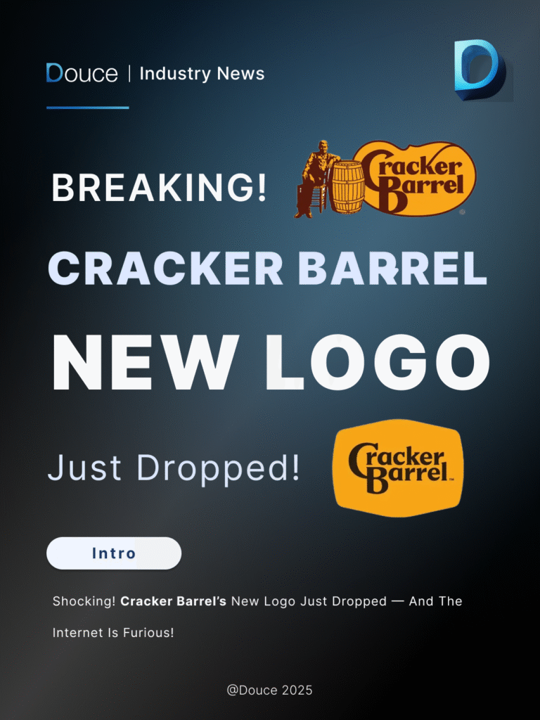
Cracker Barrel is an iconic American restaurant-and-store chain, long associated with warm Southern hospitality, rocking chairs on the porch, and nostalgic country-style décor. For decades, its rustic branding symbolized comfort and tradition — something customers deeply connected with.
But recently, the brand unveiled a new logo redesign — and the internet was not impressed.
From Nostalgia to Minimalism
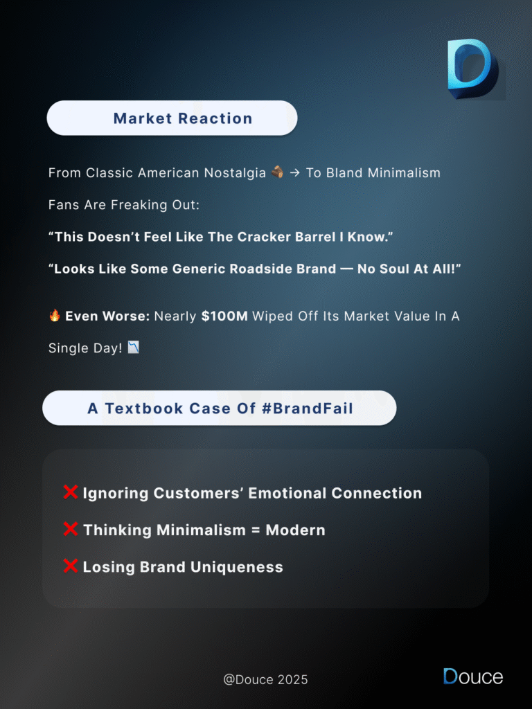
The original logo carried a sense of Americana: wood textures, vintage lettering, and a distinctive identity that fans instantly recognized. The new version, however, shifted to a stripped-down minimalistic style. While minimalism has become trendy, in this case, many felt the redesign erased the brand’s unique personality.
Comments poured in:
“This doesn’t feel like the Cracker Barrel I know.”
“It looks generic — like any roadside brand.”
The Fallout
The backlash wasn’t just emotional — it hit the bottom line. Within a single day, Cracker Barrel’s market value dropped by nearly $100 million. A stark reminder that logos are more than design assets; they’re vessels of emotional equity and customer loyalty.
Lessons for Brands
So, what went wrong? And what can other companies learn from this rebrand?
Emotional Value Matters – Customers often have a sentimental bond with heritage brands. A drastic change can feel like losing part of that identity.
Minimalism Isn’t Always Modern – Clean and simple can work, but only when it retains the essence of the brand.
Protect Uniqueness – Standing out is critical. Strip too much away, and you risk becoming forgettable.
The Takeaway
A rebrand should balance familiarity and freshness. Change is necessary to stay relevant, but the best branding upgrades evolve with the times without alienating loyal fans.
Cracker Barrel’s case is a reminder: when brands forget the emotional connection they hold with customers, even a logo change can turn into a multi-million-dollar mistake.